Colors
Our principal brand colors consist of white, black, and indigo, which are utilized for Branding, Graphic Design, and Web presentations.
Our supplementary brand colors include Blue, Green, Red, Orange, Yellow, and Purple. These hues are designated for our Logo and minor details in any visual elements.
Refrain from using secondary colors as dominant shades in design; they are intended solely for details, as each color signifies a specific role within our system.
Colors for UI Design and Data Visualization, though similar, are defined distinctly.
Primary brand colors
Black
HEX #000000
RGB 0,0,0
CMYK 60,60,60,100
Rich black
WHITE
HEX #FFFFFF
RGB 256,256,256
CMYK 0,0,0,0
WhiteC
Indigo
HEX #304FFE
RGB 48, 79, 254
CMYK 81.10,68.90,0.00,0.39
Indigo A700
Supplementary brand colors
BLUE
HEX #0084FF
RGB: 0, 132, 255
GREEN
HEX #00D151
RGB: 0, 209, 81
RED
HEX #F50043
RGB: 245, 0, 67
ORANGE
HEX #FF8500
RGB: 255, 133, 0
YELLOW
HEX #F5FF15
2RGB: 45, 255, 21
PURPLE
HEX #C900FF
RGB: 201, 0, 255
Main UI Colors
These color are to be used when designing software UI components for screens, and hand held devices.
PRIMARY / INDIGO A700
HEX #304FFE
RGB 48, 79, 254
SECONDARY / BLACK
HEX #000000
RGB 0,0,0
DEFAULT / GRAY-200
HEX #e2e8f0
RGB 226,232,240
Material UI Color
We use Material UI colors for all other colors in the UI design, which are imported into Tailwind CSS and override its default colors.
Here you can see all the possible variations that you can use in the system:
Data visualization colors
These colors are exclusively intended for data visualization, in various mediums such as charts for print, web, presentations, and applications. Do not use these colors in the UI design !
ORANGE
HEX #fe8500
RGB 254,133,0
L ORANGE
HEX #ffb000
RGB 255,176,0
L GREEN
HEX #95d13c
RGB 149,209,60
GREEN
HEX #34bc6e
RGB 52,188,110
L BLUE
HEX #71cddd
RGB 113,205,221
BLUE
HEX #5392ff
RGB 83,146,255
PINK
HEX #ff509e
RGB 255,80,158
PURPLE
HEX #9b82f3
RGB 155,130,243
Usage of colors in UI design
The color "RED" should be only used for our errors and error states
Avoid using our the color "RED" as a main color of any component in UI design, except the delete button or an error notification.
Especially as a background color for headers, sidebars, footers ...
Header
Sidebar
Don't use our brand color "RED" for main design elements in a layout, or any other red color.
404 Page not found
You didn't break the internet, but we cannot find what you are looking for.
Don't use our brand color "RED" for titles or text, except on error pages.
Loading ...
Avoid using our brand color "RED" for backgrounds of splash screens
Exceptions to this rules:
- In software applications can be used to attract attention for alerts and notifications.
- It can be used as a background for buttons in some cases, but not as a primary button color.
- Can used as a border and text color for errors in input fields, and other similar cases.
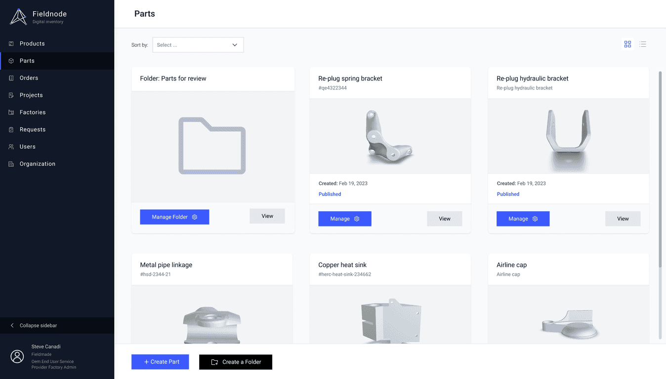
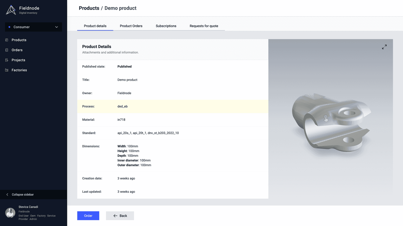
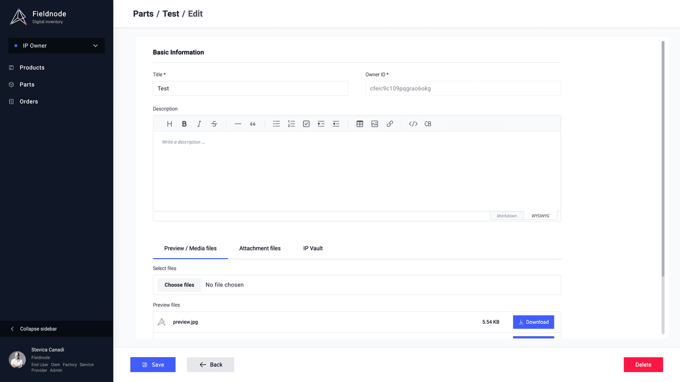
Examples of proper color usage in UI

Website homepage layout

App layout / Sidebar

App layout / Product info

App layout / Forms
Colors for data visualization in graphs