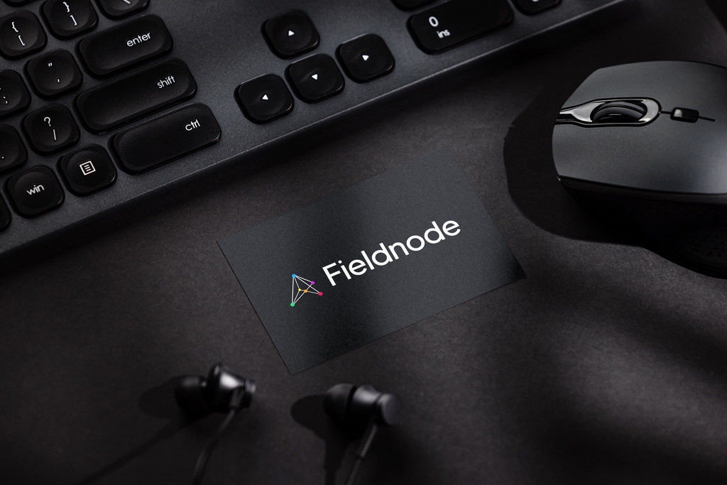
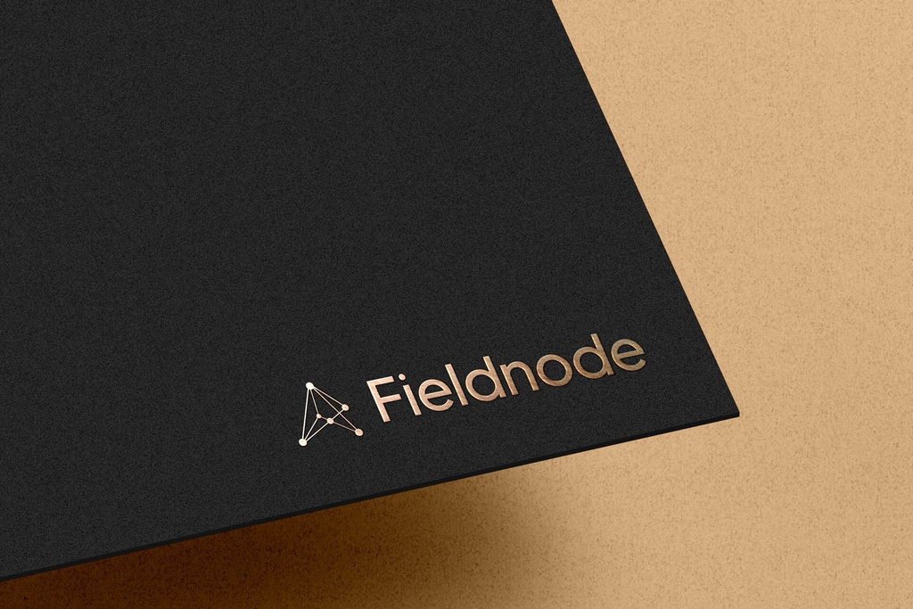
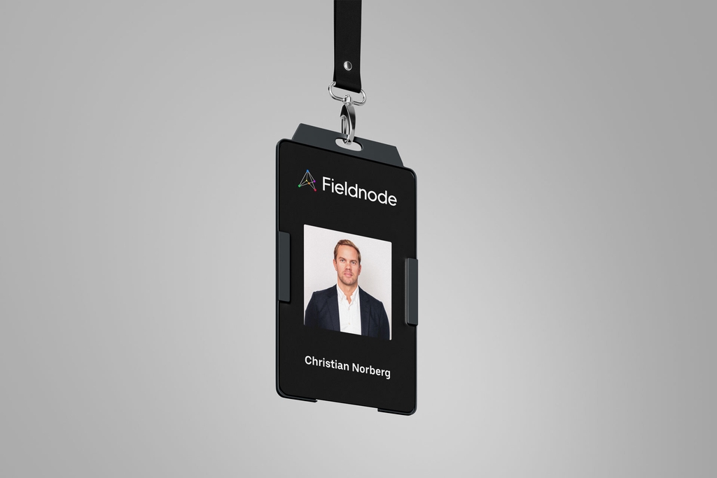
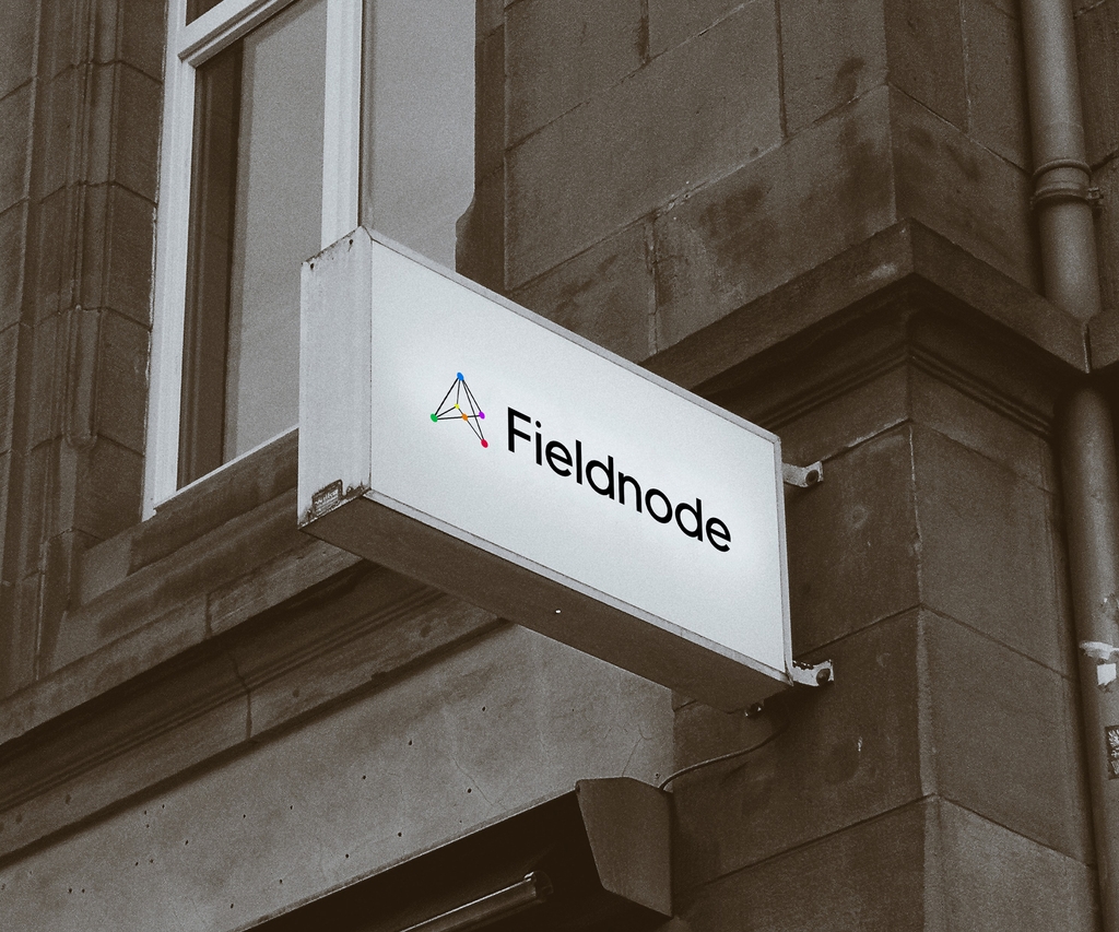
Our logo is composed of two primary components: the "Signage" symbol and the "Fieldnode" text, accompanied by the tagline "Connecting the dots."
Typically displayed as white on a black background, the logo utilizes a unique custom font.
The logo is carefully designed with a specific white space and a well-defined placement in relation to other content.
This alternative serves as our logo when there is insufficient space for the complete logotype. It solely features our logo symbol.
Utilizing just the logo sign, this variant provides a flexible option for various design scenarios where the full logotype is not feasible.
When positioning the logo in a layout with adjacent elements, it is essential to maintain minimal whitespace around the logo.
The minimum required whitespace should be equal to the height of two green circles, that are merged as seen in example below, with one circle originating from the bottom left corner of the logo.
Here are some exceptions.
Our main logo is typically displayed on a black background, with a monochromatic alternative featuring white on a black background.
For two-color printed materials, the logo can be presented in a monotone version.
However, if the printing techniques permit, using the color version of the logo is preferable.
Our logo has been thoughtfully designed to maintain its legibility and visual impact even when scaled down for various applications.
Whether it's for print materials or digital screens, the logo can be resized while retaining its clarity.
To ensure optimal readability and aesthetics, the logo's smallest width should be set at 24 pixels.
Also there are some exceptions, the maximum height of the logotype in the header or the sidebar should not exceed 80px.
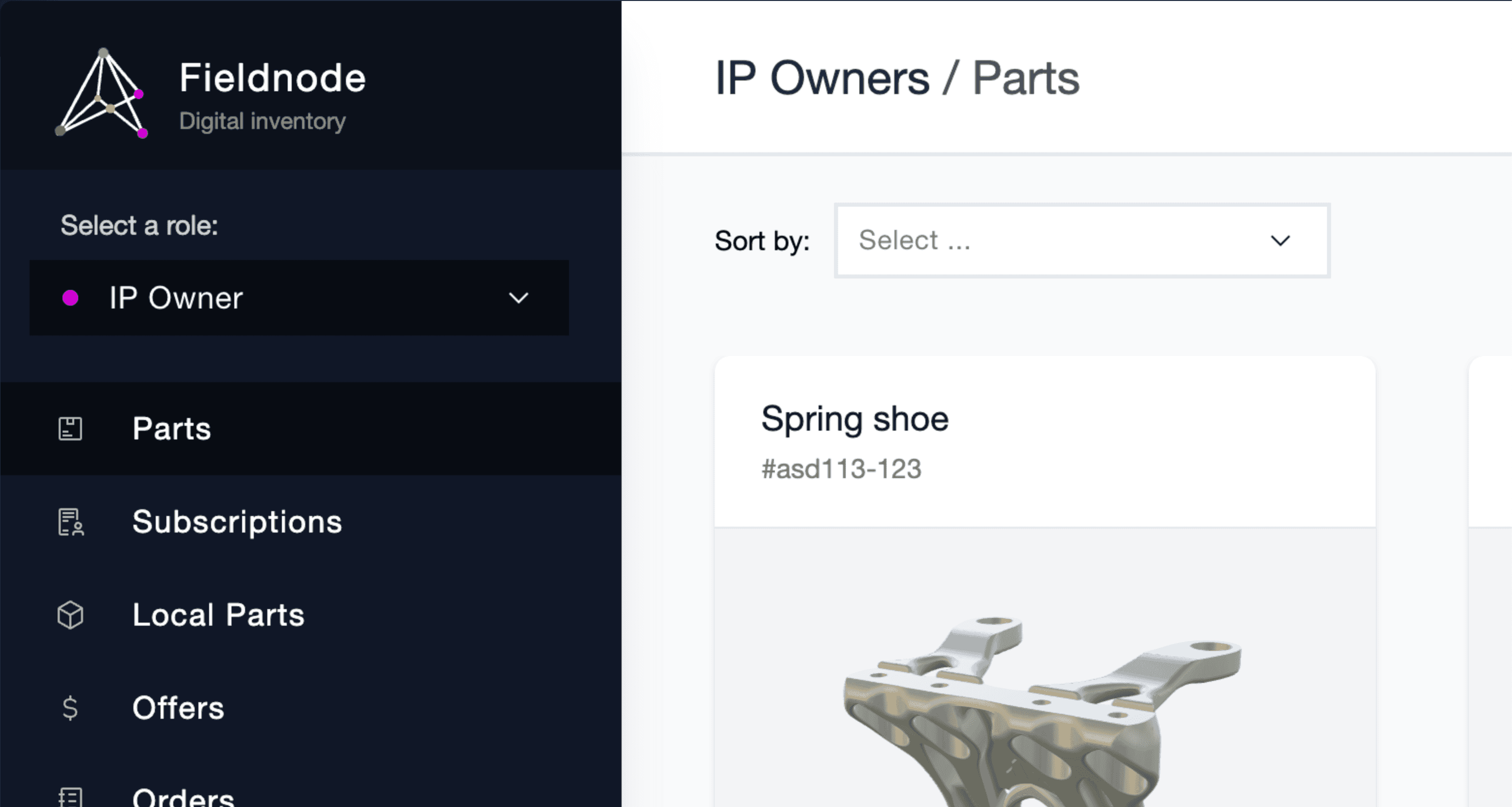
The logo can be added without the background, for example like in sidebar.

- Do not use Fieldnode as a verb (e.g. “Let’s Fieldnode to the skies.”). Instead, use it as an adjective.
- Do not use Fieldnode as a noun; "Fieldnode will secure." Instead, consider using it as an adjective.
- Do not use Fieldnode in plural or possessive form, e.g., Fieldnode's,
